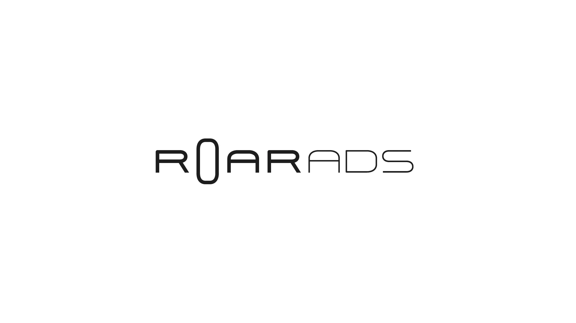
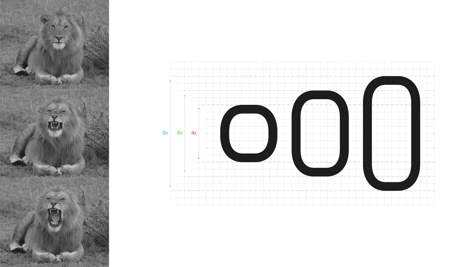
In the world of marketing, influence stems from being heard above the noise. ROARADS is built on this principle, ensuring that brands possess a professional and powerful voice in their respective fields. The company’s visual language showcases simplicity and modernity, reflecting its commitment to effective communication that hits the target precisely.
client
roarads
service
branding
date
2023
The Branding and Visual Identity project undertaken for the ROARADS digital marketing agency aimed to express both the company’s professional strength, as well as its customer-centric approach. The visual identity’s color palette and style reflect a warm and engaging approach that emphasizes attention to client needs. The main goal of the project was to translate the strong and bold communication line into a cohesive brand identity through a simple and clean visual system.
The design process was primarily focused on the artistic and symbolic function of the logotype. The letter “O” in the company’s name was selected as the central symbolic element, its shape crafted to reflect the strength and assertiveness of an animal (a lion) roaring. The use of this symbolic element not only emphasizes the brand’s communication line but also lends a modern and highly readable appearance to all brand materials.