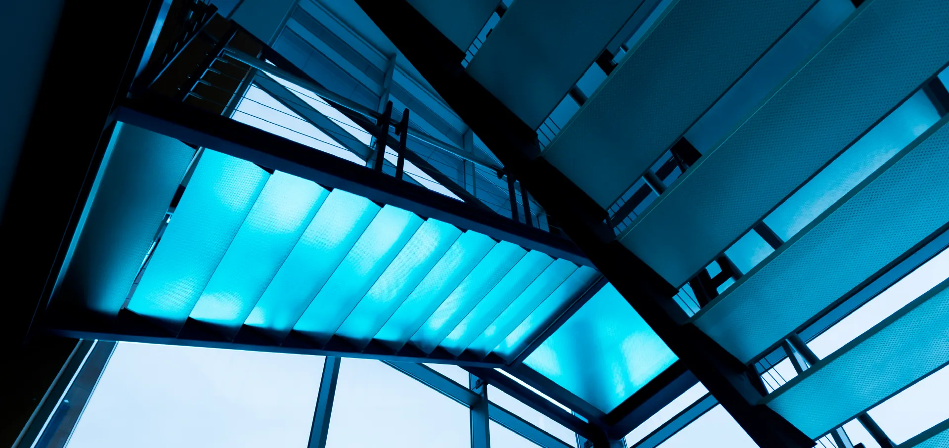
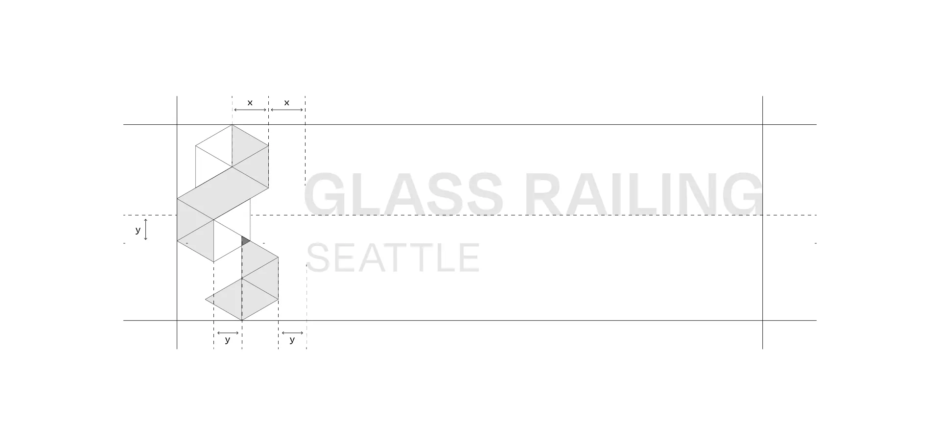
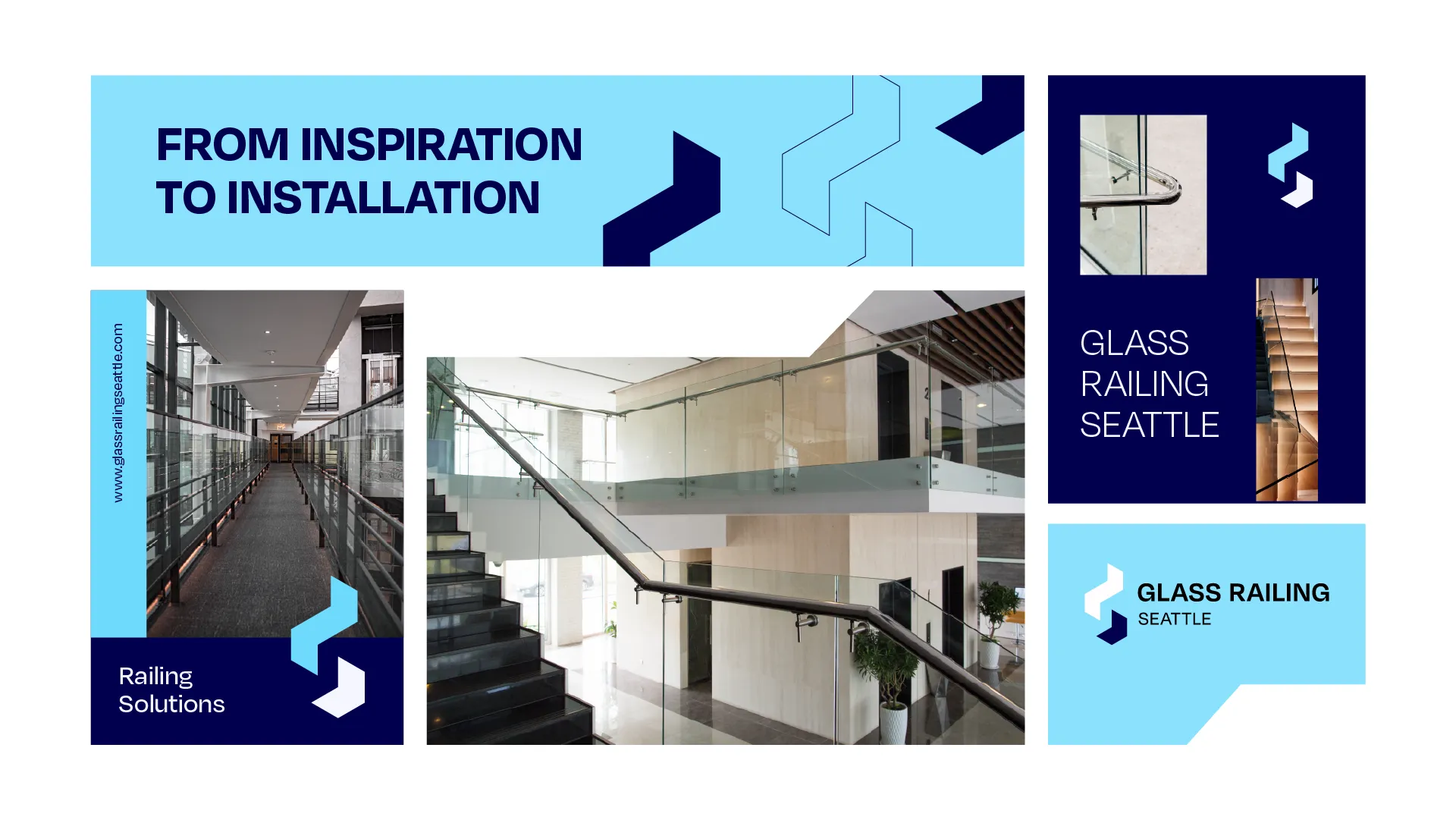
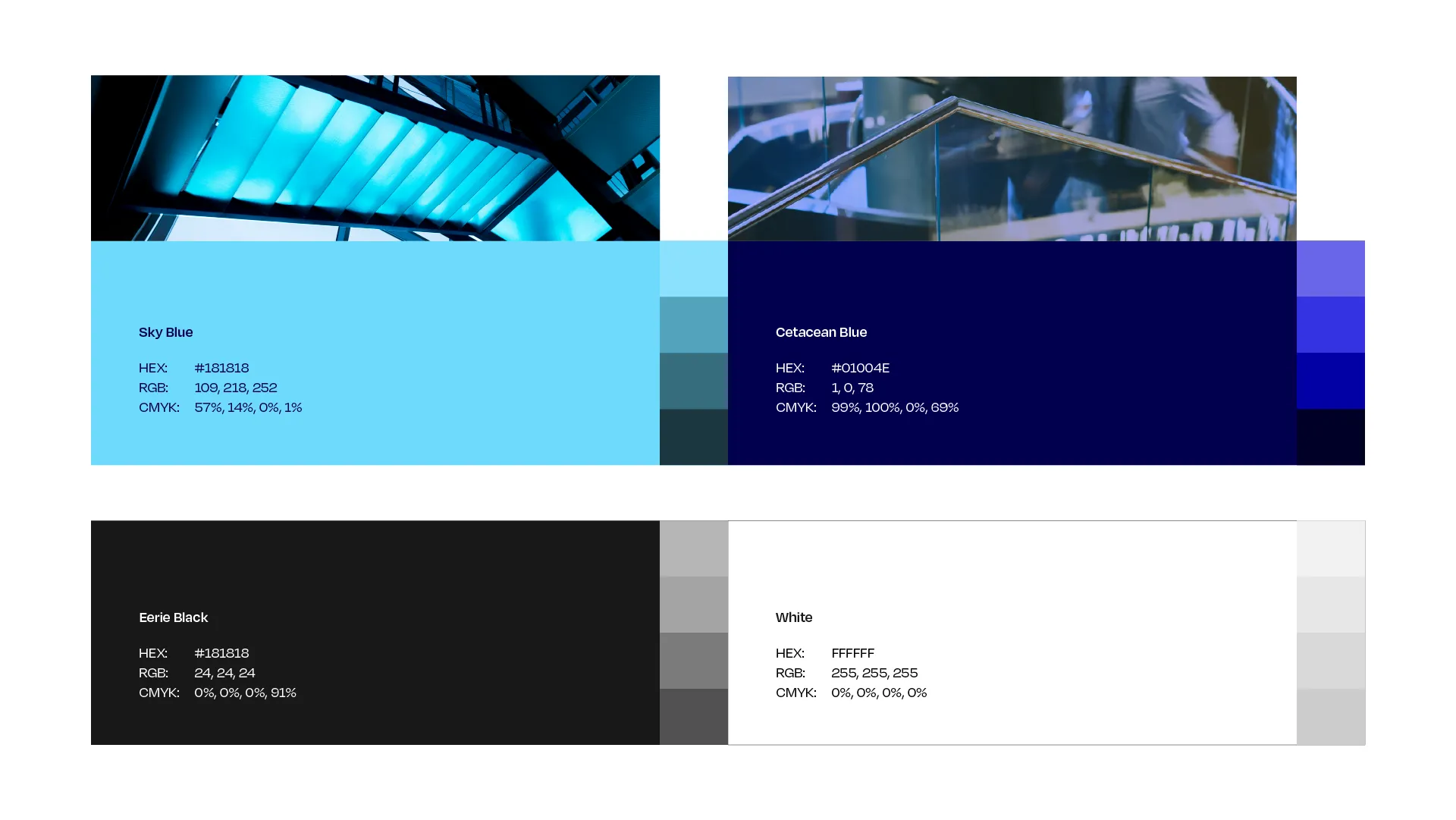
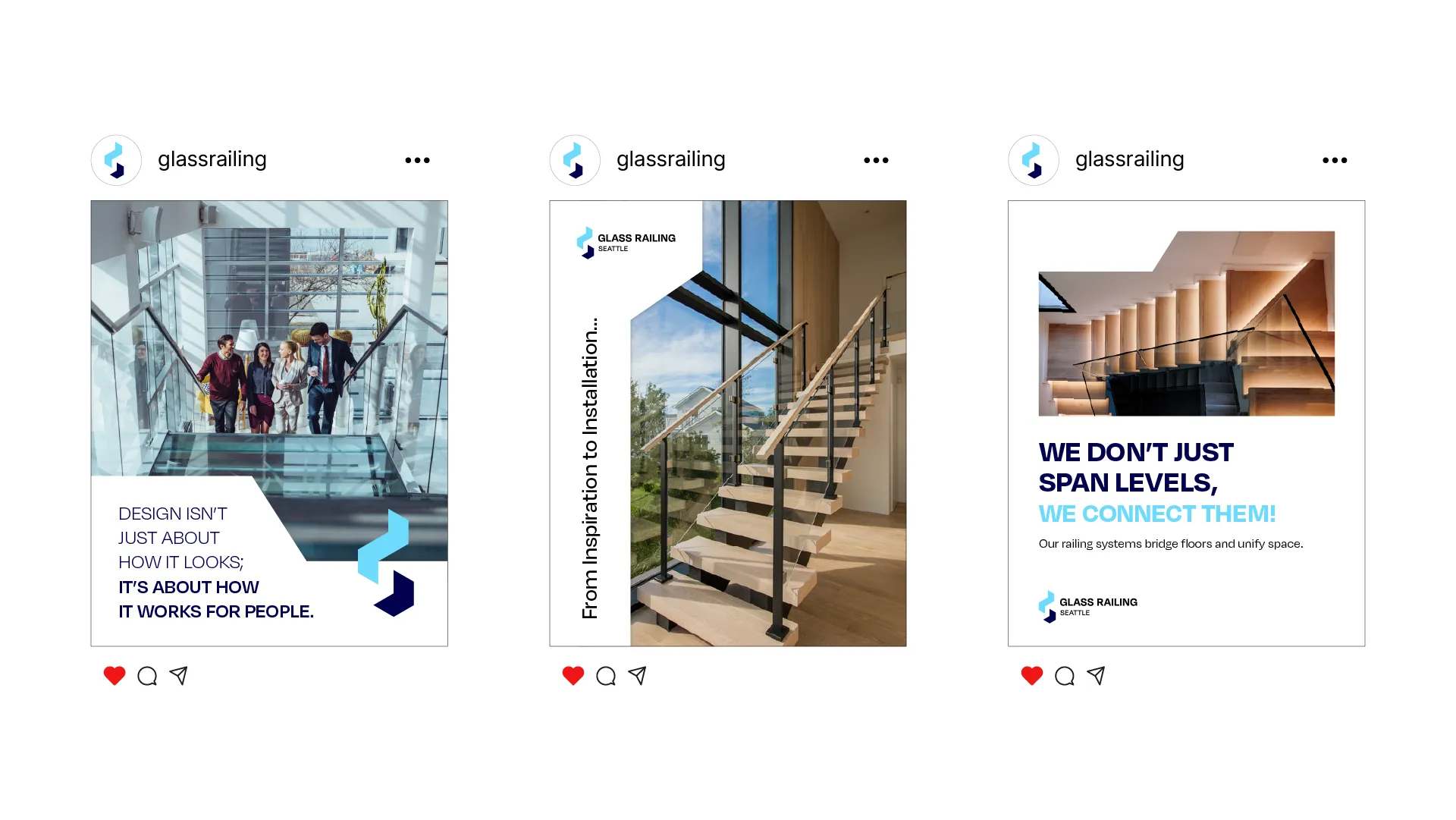
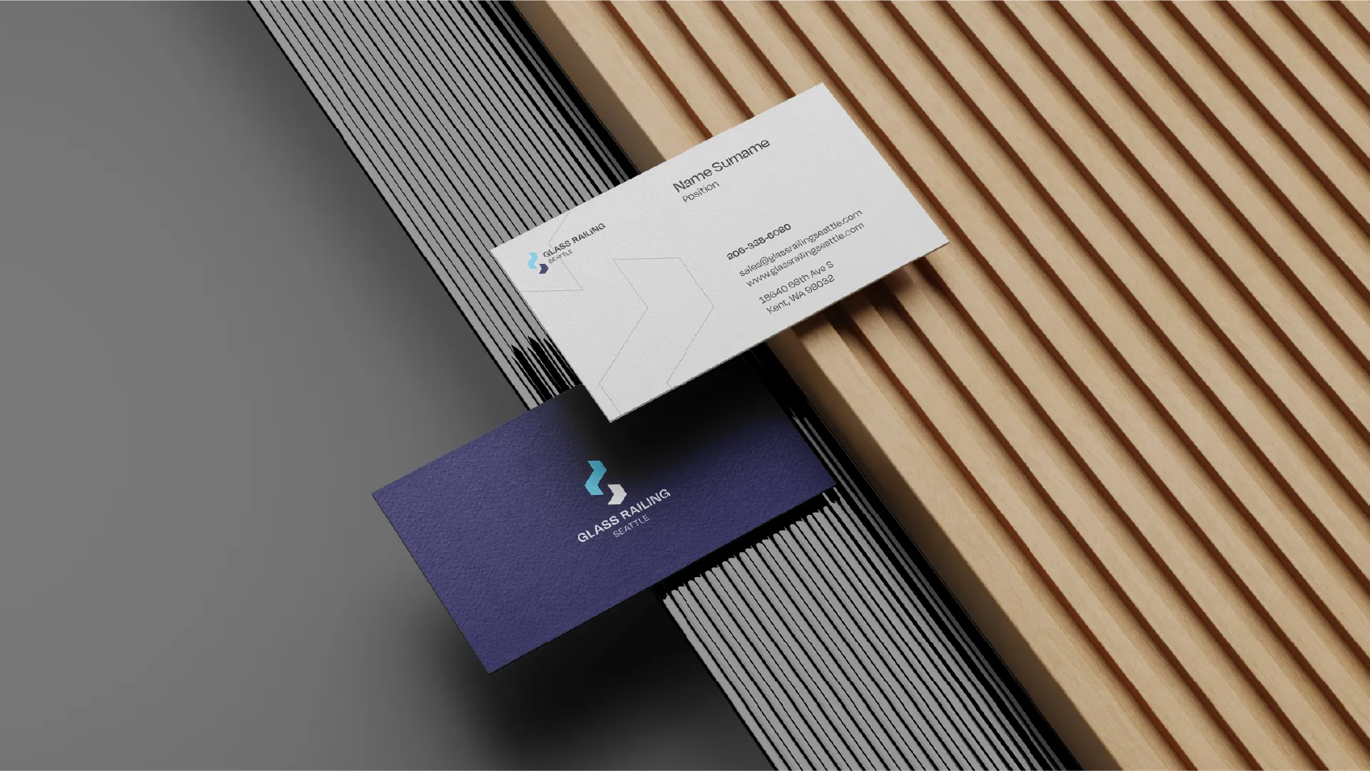
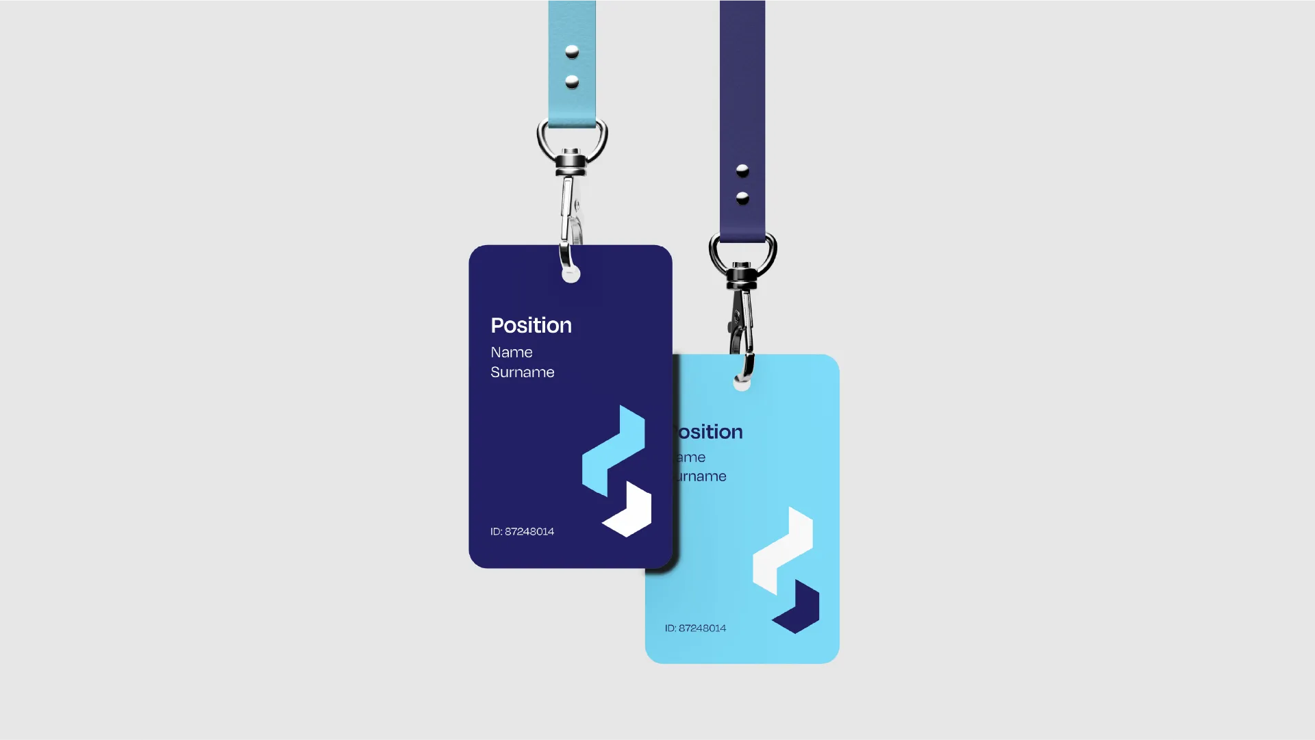
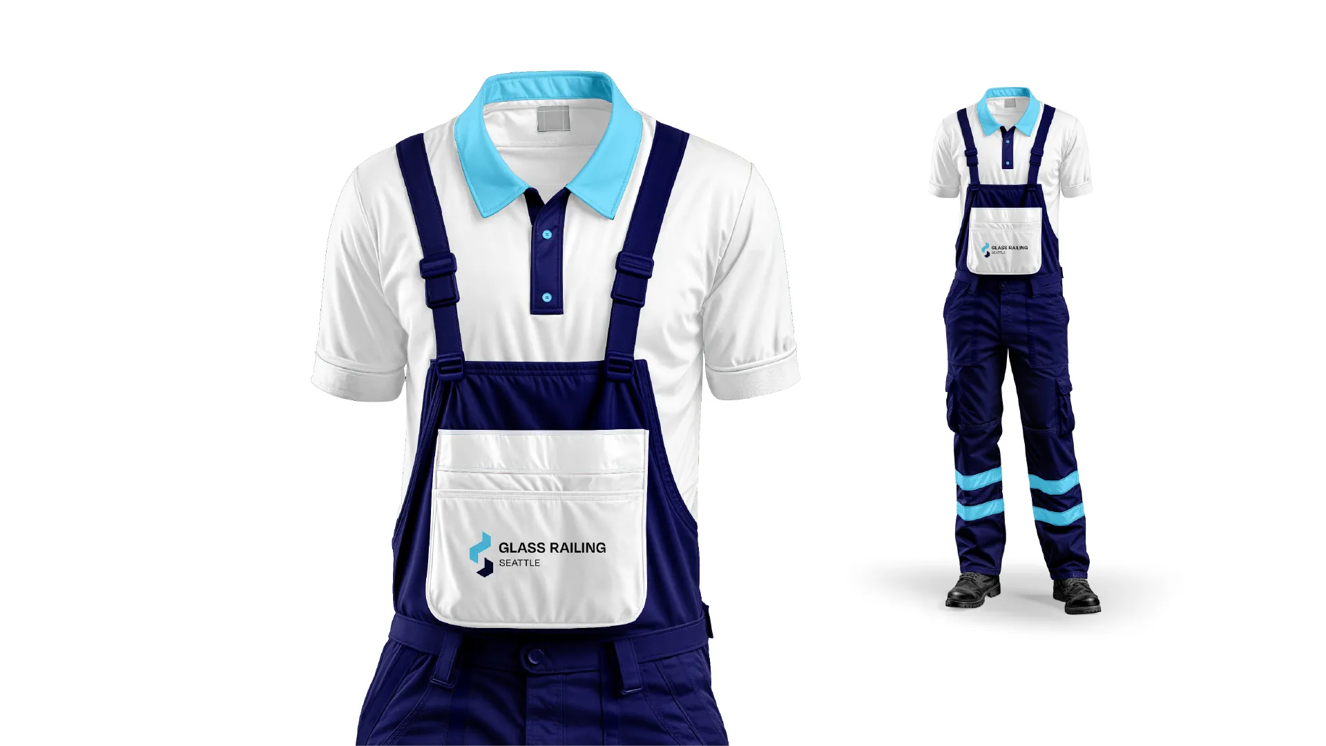
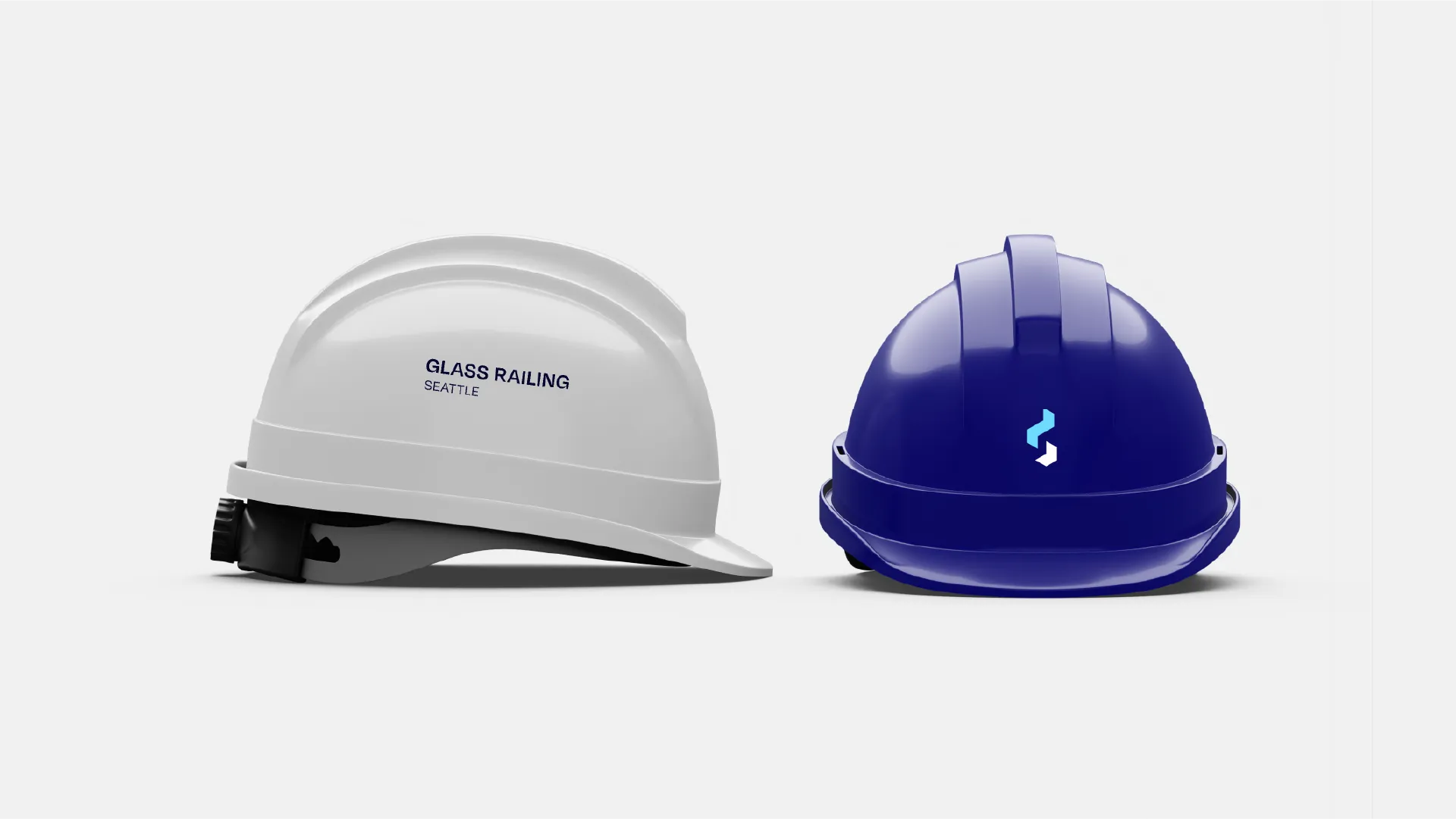
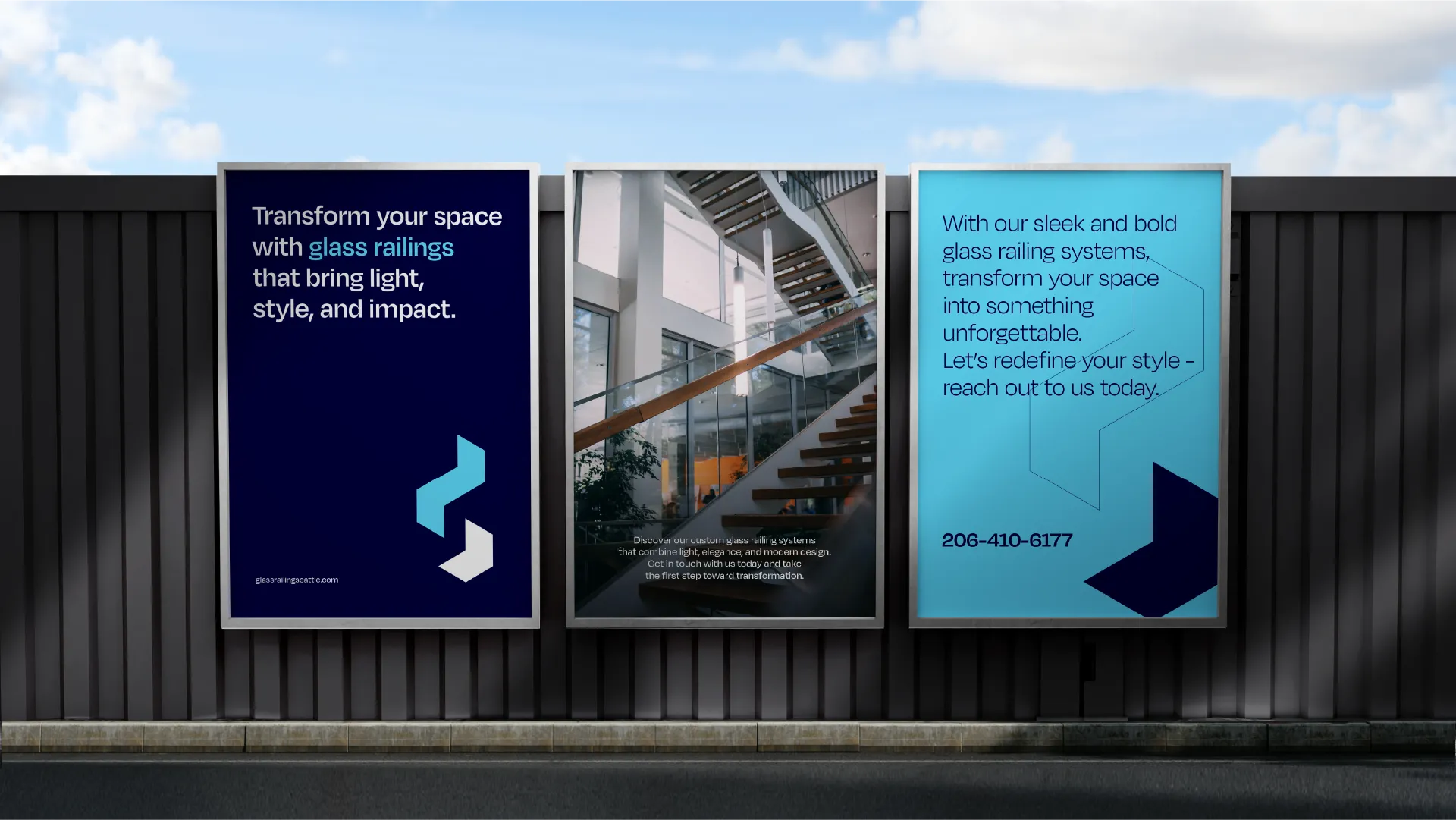
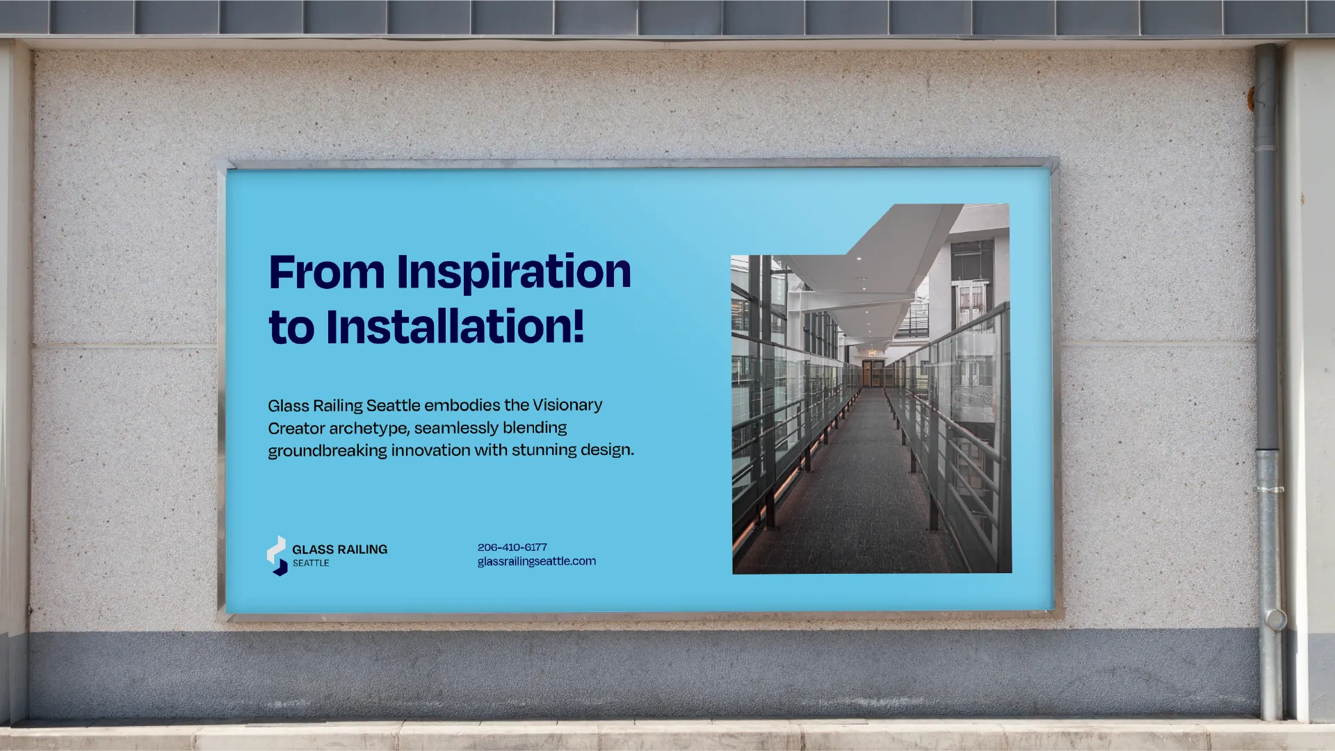
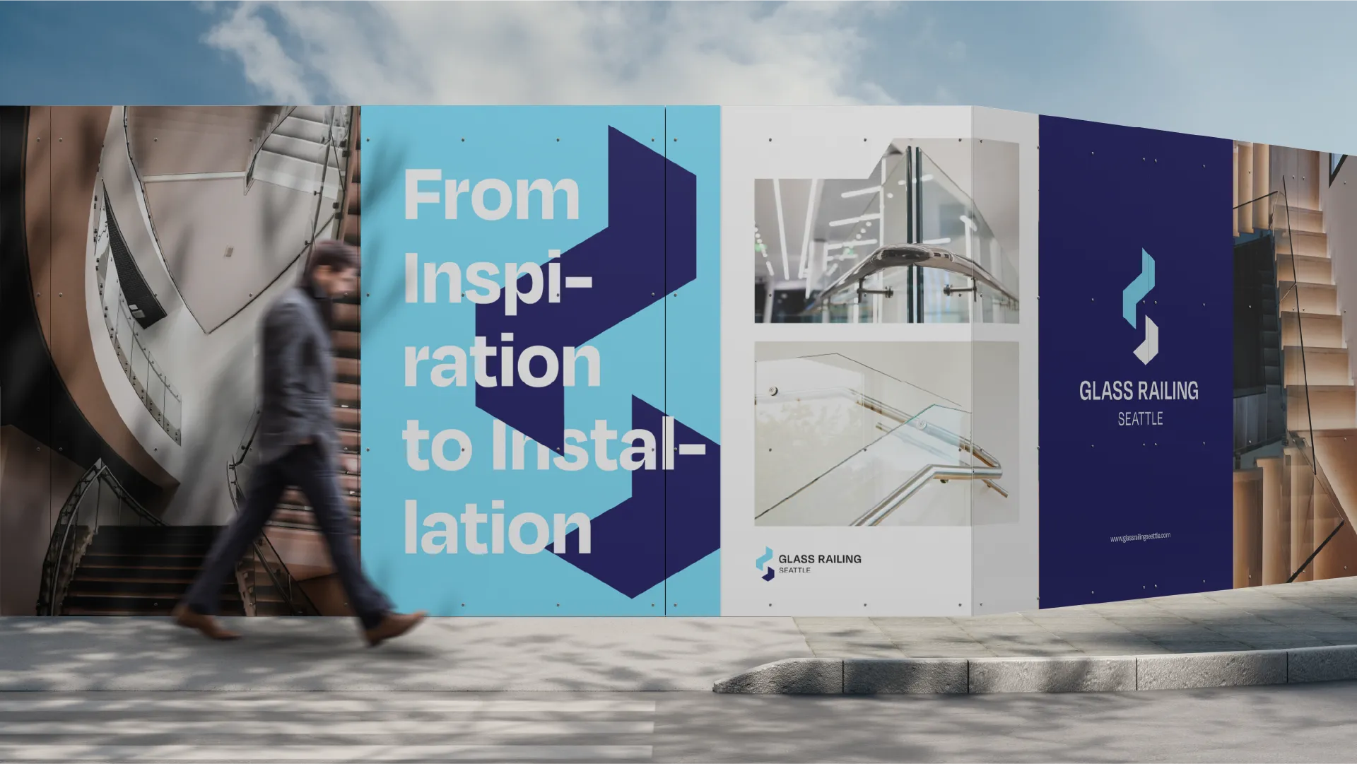
Railing systems and glass constructions integrate lightness and functionality within architecture. The Glass Railing Seattle logo is inspired precisely by these principles: transparency, modern aesthetics, and technical precision. The stepped symbolism of the Logomark brings trust and order without disrupting the visual flow of any space.
client
glass railing seattle
service
branding
date
2025
Glass Railing Seattle is a professional brand specializing in high-quality glass railing and construction systems. The application of a bold sans-serif typeface in the logo emphasized the brand’s strong and stable position in the architectural field. The main goal of the project was the creation of clean lines and a visual language compliant with industry standards.
The design of the Logomark began with a symbolic depiction of stair and railing structures that connect the upper and lower sections of spaces. In this approach, the double-wall structure reflects the connection points of the glass and the installation details. The strategy behind the color schemes (sky blue and cetacean blue) provides the brand with both visual depth and a sense of reliability and stability.