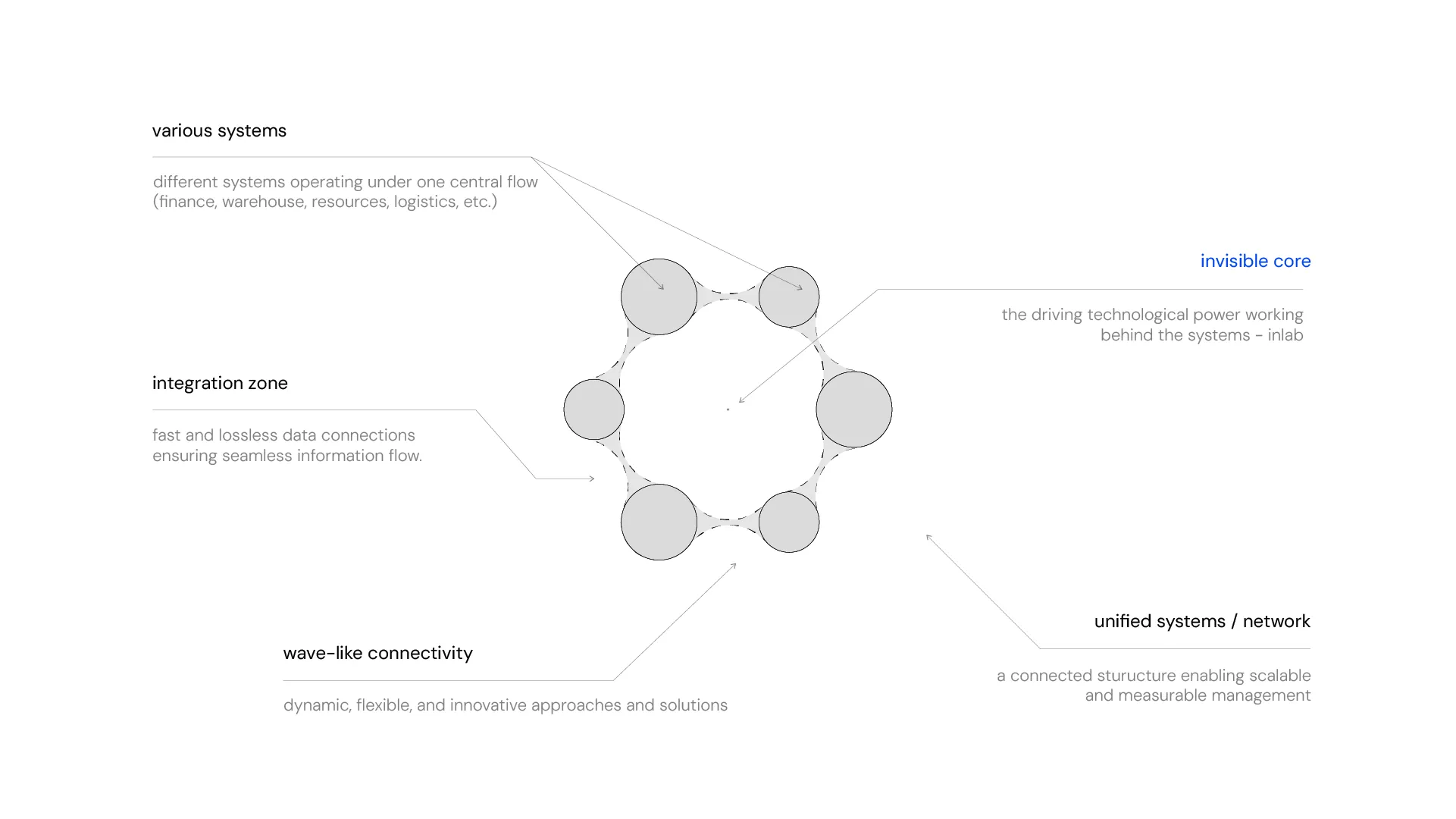
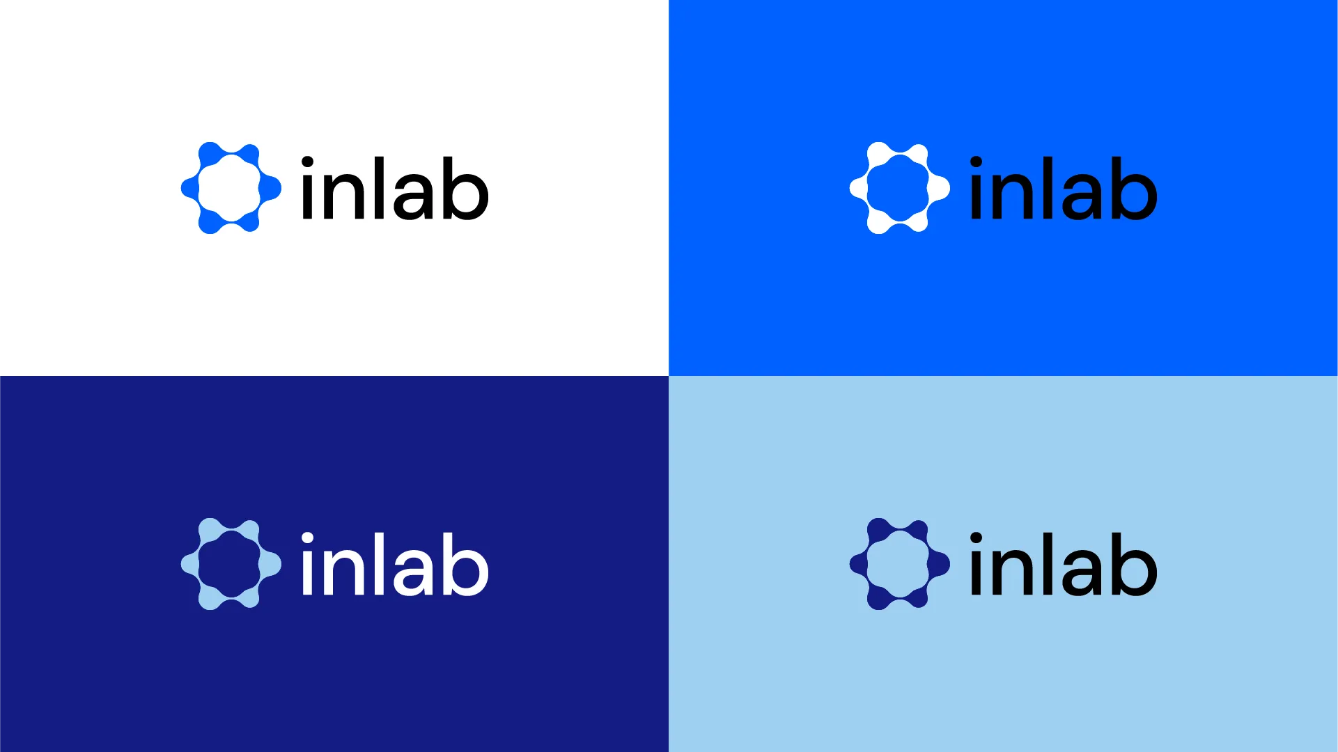
inlab is a digital transformation partner specializing in ERP and integration technologies, focused on strengthening enterprise management. For this project, we translated inlab’s values and approach, the unseen power of technology and a human-centric focus, into a visual identity.
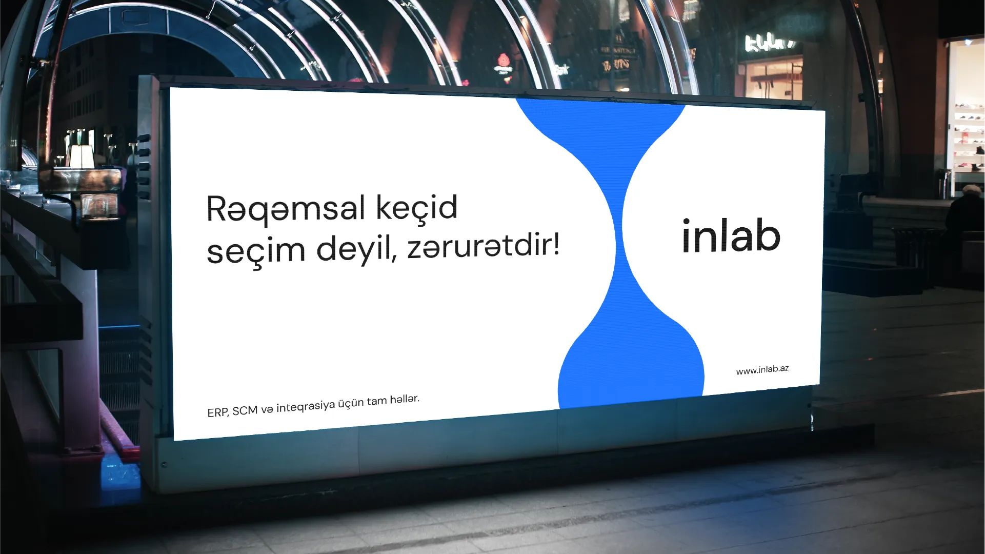
The core idea behind creating inlab’s visual identity was the concept of managing diverse systems from a single central point. Based on this, we visually expressed the center’s attractive force and the surrounding flows submitting to this power. The simplicity and order perceived by the client are, in reality, built upon the harmony generated by the unseen center (inlab).